Gone are the days of those hideous crystal chandeliers... You know the ones, dripping in small faceted pieces of that sparkly stuff in cascading or dripping off a circular frame hanging twenty feet up in the air, overtaking any Mob Family's "grand entry foyaahh" in Jersey or Staten Island... Well okay those horrible things still exist, but thank god, there are now acceptable options to still celebrate this wonderfully luxurious material... CRYSTAL.
Alison Berger is one of my favorites as she really understands how to showcase the best qualities in crystal without a thousand facets in site... Her simple straight forward approach is shown here in one of her pendants and sconces.
Timothy Oulton hasn't remade the wheel, or the chandelier, for that matter, but just added to it to make it something completely new... Who knew the addition of a simple metal sphere surrounding a classic crystal chandelier could transcend it into something completely modern and awesome?!...
Dennis and Leen's lighting is always rooted in tradition, but their shapes and applications are what keeps it fresh. Here's one of there simple chandeliers, but each metal arm is laced in beads of crystal and at the tip of each is alternating colors of crystal, intermixed with rock crystal, which is just perfection. This is a prime example of a fixture that can go in a very traditional, transitional or contemporary setting without being an eye sore.
Michael McHale has taken my favorite look, industrial chic and given it just a bit of sparkle... This gives the otherwise very bare and sometimes very masculine look a feminine touch, which is still very much acceptable in any guy's eyes. So chic...
My world is all about being creative, and assisting those in making beautiful ideas and visions come to life. I wanted to show what inspires me, and share some great thoughts, tips and other wonderfully beautiful things that keep my imagination and innovation going... Where do you find your inspiration?
Tuesday, January 31, 2012
Saturday, January 28, 2012
Who did it better?...
I've been scrolling through hundreds and hundreds of fabulous images of the latest menswear collections for my contributions to the Fashion + Decor website due to launch next month, which is ridiculously exciting... But in doing so I noticed a few looks that were remarkably similar to each other. So this leads me to my question of, "Who did it better?"
Both Moschino and Jean Paul Gaultier's Fall 2012 collections were quite graphic and celebrated pattern, but what are the odds the patterns are basically the same? Who did the better grey brick pattern?
Not only did the two fashion powerhouses utilize the same grey brick pattern, but also in orange? I don't get it... Who leaked the information, or is this a true trend happening, and they are the only ones that know of "Brick Layer Chic"? Hehehe...
Moschino again is in the hotseat, this time comparing graffiti patterns with Dries Van Noten's 2012 Fall Collection... What do you think?
Who did it better? You be the judge!
Wednesday, January 25, 2012
A Picture is Worth a Thousand Words...
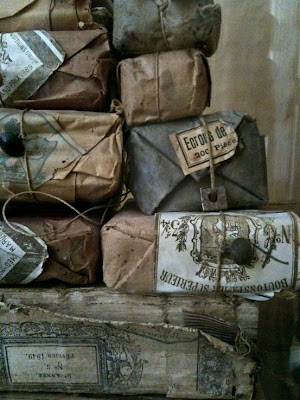
Here's "three thousand words" that I just find particularly intriguing...
These are just a few of the images I've got on my Pinterest page... Come join me!
These are just a few of the images I've got on my Pinterest page... Come join me!
Subscribe to:
Posts (Atom)


