My world is all about being creative, and assisting those in making beautiful ideas and visions come to life. I wanted to show what inspires me, and share some great thoughts, tips and other wonderfully beautiful things that keep my imagination and innovation going... Where do you find your inspiration?
So often there are conversations between designer and client as to why, this sofa is $1,500 and this sofa is $6,500... Well, as we all know, the devil is in the details... Many times we can't see what the differences are because it's integral into the structure and framing of the piece. Why is a bag from Target $50 and an Hermes bag $5,000? Same thing...
Here are some great detail shots of visible reasons why I'd pay more for something!
It's the little details that are vital. Little things make big things happen.
Copper is a chemical element with the symbol Cu (from Latin: cuprum) and atomic number 29. It is a ductile metal with very high thermal and electrical conductivity.
Pure copper is soft and malleable; a freshly exposed surface has a
reddish-orange color. It is used as a conductor of heat and electricity,
a building material, and a constituent of various metal alloys. (from Wiki)
All is know is that I love the warmth and dimension of copper, but it so rarely used... Why is that? I know it's a difficult metal to sometime coordinate with because of the underlying orange tones.
We love to see gorgeous kitchen cook wear in this alloy, but I'd love to see more!
The great thing about copper is because of the way it naturally tarishes and patinas, it has several gorgeous shades of brown and greens that occur, making it such an interesting choice.
Here's a few images pulled from Pinterest, that just re-affirms that Copper is so underused and under-appreciated! So chic!
Hope this makes you think about how gorgeous this could be in your space, and not just in your piggy bank or lost in your sofa cushions...
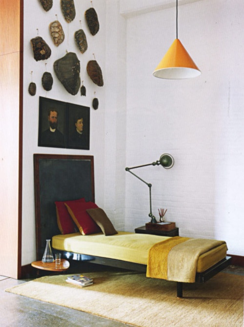
So yesterday just browsing around the mall with the family, I didn't mean to purchase anything, but of course HAD to leave with something to make it feel like it was a worthwhile trip for all of Team Wisler... (I admit, I've got a shopping problem... That's another blog post all on its own!)
So I ended up just grabbing a pair of slim Mustard trousers, and it got me thinking about how much this color is coming back around...
No, I'm not talking about getting all Brady Bunch! Although, there are quite a few good things that 70's decor did give us...
Unfortunately much of what we remember from that Disco era is more in the Harvest Gold or Goldenrod colors, specifically those "awesome" kitchen appliances!
We've come a long ways in its coloration and usage. Mustard is a wonderful accent in many schemes! I just grabbed a few from the Design Seeds site...
I think the idea of a color like this is to use it in very deliberate, but sparing applications... Here are a bunch of great images from Pinterest that celebrate one of my favorite condiments natural beauty!
Go ahead, give it a try, I think you'll find you may create a delicious environment!
It was just over a year ago I happened to stop into the newly opened AXOR showroom in the Meatpacking District, when I was fortunate enough to stumble upon the Prouvé RAW Pop Up! This was really the first time I was honestly exposed to this genius... This Jean Prouvé by G-Star RAW for Vitra installation was a celebration of what is wonderful and very utilitarian about both Prouvé and the G-Star brands.
Anyone who knows me also knows I die over my G-Star RAW denim, as it's always right on point with form, function and of course a bit of funky!
Heck I even rocked a pair of Arc 3D Loose Tapered jeans during my filming of "George to the Rescue"!... Which if you haven't already, click the link to watch it! Good television! Great design!... Just saying...
"Jean Prouvé (1901-1984): French Industrial- and Furniture Designer and
Architect. Jean Prouvé is one of the most influential furniture
designers of the early modern design movement, Jean Prouvé introduced
the machine age and industrial engineered modern design aesthetic to
interiors in the steel, aluminum and architecture he created. He then
continued her experiments with different materials.
Jean Prouvé was both engineer and modern designer.
Jean Prouvé was once quoted saying: never design anything that cannot be made." quote from Jean Prouvé Museum.
His simple aesthetic of function vs. frill is something that I admire, and I can't lie, desire! As in I totally want everything!!! His seating is amazing, his lighting is divine, I could live in a home exclusively furnished with his pieces.
Basically all I'm saying is, if I saw this over a year ago and I'm still thinking about it today... Something was REALLY right about it!
Such an icon in the design world, that if you didn't know before, you do now... He's one of my favorites, and after seeing all this awesomeness, I hope you'll find an appreciation for this man's work as well!
Fall brings on change... The weather cools down and nature's colors take on the most amazing spectrum of rich hues...
The leaves are gold, orange and brown, but also shades of crimson, violet, cerulean and charcoal are definitely present. Pantone's Fall 2012 Men's Fashion Trends Colors look like a case study in this photo of leaves I snapped.
Interiors are always influenced by fashion as we all know, but at a much slower rate... Benjamin Moore created Color Stories. "Inspired by nature, the senses, moments in time, found objects and pure imagination, each of our Benjamin Moore Color Stories has an enticing tale to tell." It's a wonderful and timeless palate of colors able to be incorporated into any environment.
Here are a few examples of these trend colors used in effortless ways... All the images found on Pinterest...