Monday, October 29, 2012

In the details...

So often there are conversations between designer and client as to why, this sofa is $1,500 and this sofa is $6,500... Well, as we all know, the devil is in the details... Many times we can't see what the differences are because it's integral into the structure and framing of the piece. Why is a bag from Target $50 and an Hermes bag $5,000? Same thing...

Here are some great detail shots of visible reasons why I'd pay more for something!


It's the little details that are vital. Little things make big things happen.
~John Wooden


Sunday, October 28, 2012

Copper, the underused metal option...

Copper is a chemical element with the symbol Cu (from Latin: cuprum) and atomic number 29. It is a ductile metal with very high thermal and electrical conductivity. Pure copper is soft and malleable; a freshly exposed surface has a reddish-orange color. It is used as a conductor of heat and electricity, a building material, and a constituent of various metal alloys. (from Wiki)


All is know is that I love the warmth and dimension of copper, but it so rarely used... Why is that? I know it's a difficult metal to sometime coordinate with because of the underlying orange tones.


We love to see gorgeous kitchen cook wear in this alloy, but I'd love to see more!


The great thing about copper is because of the way it naturally tarishes and patinas, it has several gorgeous shades of brown and greens that occur, making it such an interesting choice.


Here's a few images pulled from Pinterest, that just re-affirms that Copper is so underused and under-appreciated! So chic!


Hope this makes you think about how gorgeous this could be in your space, and not just in your piggy bank or lost in your sofa cushions...

Sunday, October 21, 2012

Mustard love...

So yesterday just browsing around the mall with the family, I didn't mean to purchase anything, but of course HAD to leave with something to make it feel like it was a worthwhile trip for all of Team Wisler... (I admit, I've got a shopping problem... That's another blog post all on its own!)

So I ended up just grabbing a pair of slim Mustard trousers, and it got me thinking about how much this color is coming back around...


No, I'm not talking about getting all Brady Bunch! Although, there are quite a few good things that 70's decor did give us...


Unfortunately much of what we remember from that Disco era is more in the Harvest Gold or Goldenrod colors, specifically those "awesome" kitchen appliances!


We've come a long ways in its coloration and usage. Mustard is a wonderful accent in many schemes! I just grabbed a few from the Design Seeds site...


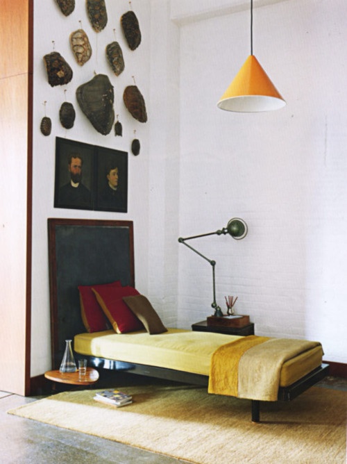
I think the idea of a color like this is to use it in very deliberate, but sparing applications... Here are a bunch of great images from Pinterest that celebrate one of my favorite condiments natural beauty!


Go ahead, give it a try, I think you'll find you may create a delicious environment!