Sunday, December 26, 2010

Thank you for the Invites over the year!...

I also just wanted to thank some amazing people for inviting me to celebrate the design industry this year...

Thank you to the amazing team over at DIRTT, who showed me a good time at IIDA's Color Invasion.  They are the leaders in sustainable modular wall systems, and I'm proud to say that I completed a spectacular project earlier in the year for Infusion Development.  Here's a youtube link to the case study of my project.


Next, thank you to the guys over at DUNE.  These fellas have perfected modern and contemporary furnishings for both the residential and commercial market, not to mention, just being completely lovely people to work with.  They were gracious enough to allow me to experience Interior Design's Hall of Fame Dinner at the Waldorf Astoria with them.  What a wonderful evening of celebration for the design community.


Lastly to the vivacious group over at the high end outdoor furniture company, Janus et Cie.  I was fortunate enough to be one of the select few this year to spend an evening with a handful of New York's top designers and architects, hosted by the owner of the company.  She goes all out for the dinner and launch of her new lines every year, and this was no different as shown in her facebook page.

Trend predictions for 2011

I hope everyone had the most wonderful holiday celebrations, and as we're approaching yet another year I'm sure all of you are just on the edge of your seats, wondering what the upcoming interior trends are going to be...  You're not the only one, when you figure it out, give me a call...  Hehehehe.  Just kidding...

I honestly think as the economy is slowly turning and people are feeling a bit better about spending money and people are understanding that the world is getting better, a lean towards color and bolder patterns is going to be gaining in popularity.

The past couple of years has had my designs filled with lots of more somber colors like greys and taupes, which I love, so no worries that those great neutrals are on the decline, but these in combination with vivid colors is what I'm looking forward to...

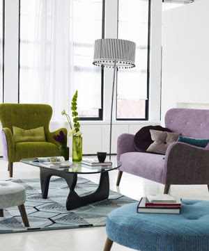
Check out these inspirational images of fabrics, furnishing and soft treatments from The Shade Store, featuring Paul Smith's collection for Maharam, and some of the newest ideas from Designer's Guild.


Live your life in color!  Happy New Year to all!...

Friday, December 24, 2010

Happy Holidays!!!

I've been terribly delinquent in posting anything recently, but have the holidays and multiple birthdays to blame...  Not really an excuse, but I think as good as any.

So from my beautiful family here on the East Coast, and in Hawaii.


Mele Kalikimaka

Sunday, December 5, 2010

Highlights Past Projects: Iguazu Day Spa

Great full service day spa celebrating the magnificent Iguazu Falls through my use of exotic woods and rustic stone, blended with contemporary materials, ie. glass river rock tiles, to create a soothing sanctuary to lose yourself for an manicure or a full day of pampering...

Front desk detail looking onward towards the slate wrapped staircase.
Front desk view, showing off the Brazilian Teak veneer mixed with a brown glass mosaic to produce an interesting but not overwhelming mix of materials welcoming you into the spa.
Colorful slate tiles up the stairs to the mezzanine level and other treatment rooms. Also clear glass river stone tiles with blue grout, against a background of Brazilian Walnut floors.
Brazilian Teak wall with specifically placed shelves in the same material for votive candles. Built-in recessed lights shoot upward to create interesting light and shadows while relaxing in the lounge area.
View from the mezzanine level's relaxation area, showing the combination of materials used on the floor to create the sense of moving water...
 Give the gift of relaxation to either yourself or your loved ones.  Visit Iguazu Day Spa!

Friday, December 3, 2010

Inexpensive and interesting ornaments to dress up the holidays...

On Wednesday I had a major black tie event, called the Hall of Fame dinner at the Waldorf Astoria, sponsored by Interior Design Magazine, which was quite a day...  A story for another time, but let's just say the tux didn't fit, 5 hours before the event, and I'm running around the city in a torrential rainstorm trying to find a suitable alternative for this $650 a ticket dinner I was invited to... CRAZY!  I made it work...

Anyway... I stopped off at my friend's place, Iguazu Day Spa, which I designed by the way to shower and get ready for the dinner, and he had these wonderful ornaments on a branch near his reception desk...  Hand blown glass teardrops with peacock feathers gingerly placed in each... So beautiful and chic.  I asked where he got them; he winced a little, because he always feels like he taking the "cheap" way out when he talks to me, but uttered "Crate and Barrel".  I was impressed.  So simple, beautiful and unique. 


So elegant, it'll dress up any tree, or just a tree branch...  And folks, these little jewels are on sale!!!  Check out the Teardrop Ornament with Peacock Feather from Crate and Barrel!...

Sunday, November 28, 2010

Give the gift of color...

Do you have that friend that you don't know what to get?  Maybe a guy that has a stale and monotone home, that is screaming for a punch of color and life?  Well, here's a great way to add the pizazz without breaking the bank, and in a useful way...  I know that pillows are the easy way to go, but how about a pouf or ottoman?  I just found a great little collection of African Dutch Wax-Printed Ottomans from Anthropologie.  These lovely cubes will give you just a little bit of a wow factor in a vanilla looking room!

Dutch Wax Ottoman, $198.00

Friday, November 26, 2010

Everyone deserves a piece of iconic furniture...

Now through December 13th, treat yourself or someone you love to a furniture that has stood the test of time with quality, durability and aesthetics...  Both The Conran Shop and DWR are offering 15% off of their Herman Miller lines.  This is a rare opportunity to get that amazing Eames Lounge Chair you've always drooled over, or update the look of your dining room with some amazing new Eames Molded Plastic Dowel Leg Side Chairs...  The price doesn't get any better than this!!!

Eames Molded Plastic Dowel Leg Side Chair
Eames Lounge Chair and Ottoman
Eames Molded Plywood Lounge Chair

Unexpected "Find" of the day...

Hey Guys, so I just want to say Happy Thanksgiving to all, and I do hope you had a beautiful day of friends, family and good food!...  Once Turkey Day is over, you know it's then the craziness of holiday shopping.  So if you're looking for a gift for yourself, or just a friend who appreciates great design, I think I've got a great suggestion...

I literally was just scanning over my normal sites, when I saw these two pillows from Room and Board.

Root 17 Square Pillow in Mocha

Shadow 11"x17" Pillow in Off-White
Ummm, these pillows are both knit with 25-35% Mohair!!!...  This is ridiculous...  They are on sale for $39.99, originally $149.00 and $129.00!...  These are definitely simple enough to fit into most people's decor, and how luxe is that!  Even the fill for the pillows is wonderful at a 95% feather, 5% down ratio which is a hell of a lot better than any of the other big named furniture chains that normally just use a poly fiber fill.  Super great idea for all those designer types in your life... 

Sunday, November 21, 2010

Small touches to impress...

A favorite little item of mine to just finish off any bedroom with both style and function is a beautiful and simple water carafe with glass...  It's a great thing to have alongside your bed on those dry winter nights.  What a perfectly simple idea, but it's these small touches that warms up a room, and gives you that "designer" touch.

Simple blown glass carafe to add style to any bedroom

One of the most affordable and smart looking carafe sets is shown above from Waterworks.  The shape is so architectural but simple, it'll transition into any environment, modern or traditional, and I guarantee anyone so fortunate to be a guest in your room will be impressed by the attention to detail.

Saturday, November 20, 2010

Inexpensive Art...

Well we all can't be millionaires like my clients, but that doesn't mean that we can't fill our walls with art just as amazing...  Art's such a funny thing since it's so subjective, so the value of a piece is all in who owns and appreciates it.

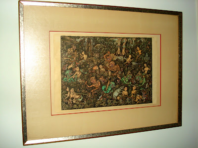
Sensual Hand Colored Indian Etching

So this little find was tucked away behind several scary needlepoint projects at my local Goodwill... Yeah, I said it... Goodwill!  It was in a hideous plastic frame, and it was all of $5.99.  I thought the colors and details were so interesting, not to mention the racy subject matter, I couldn't resist but to "splurge".

Detail of Etching

Okay, so I admit, it's not everyone's taste, but it was under $6.  Am I really going to be picky?  I had an empty frame, that again, once you put a mat around something, its importance is heightened exponentially...  I love it.  It's just to right on my wall when you enter my bedroom...  Sort of apropos wouldn't you say?

An example of fine contemporary art by a young up and comer

What do you think of this contemporary masterpiece?  It's a Paolo original from his early works during his graphics period...  Yeah, that's right, it's my 4-year old son's handy work.  I understand that 95% of what your kids come home with are less than thrilling, and will not be likely to make it into the Metropolitan, but there's the occasional piece that even inspires the adults.  I was just going through all of his papers piling up, and this fun piece jumped out.  Again, I had a spare frame, with the perfect sized mat, and voila!  Instantly a priceless work from a true artist!...

The perfect art alongside our bed...
 
So this was paired with a very old Japanese Shunga pictorial, and the contrast in subject matter and colors is just what this bare wall behind our bed needed.

Art is such a personal thing, and so is your home... Not only is finding wonderful art at inexpensive prices financially fulfilling, but also visually.  Displaying your little ones art in this manner builds up their self esteem and hopefully promotes their minds to be even more creative!  You'll be pleasantly surprised at all the amazing things that your home can be filled with, by just using a frame!

Wednesday, November 17, 2010

Let's talk accessories...

So in my last post I showed you the DIY shelving unit Adrian and I did, which I think was quite successful and pretty damn useful... So in looking at the photo I took, I realized that sometimes people leave their shelves open, or can't decide how much, or what items to put on display...  Basically there's really not a wrong or right, it's proportions and collections that make things look cohesive and balanced.


So what accessories should look like in your space is a collection of your travels, of who you are, what you love and find interesting... There's an infinite number of combinations to how things can be arranged, but playing with proportions is what keeps things looking organized, and not like tchotchke hell...

Make sure to give items breathing room, this creates importance for the pieces, but also, create small groupings of items... This introduces the collections, and personal interests to the display.  For example the small collection of tea pots is something that Adrian was collecting at one time.  He's actually got more than a dozen, but given the small space, we chose a cluster of three to show off.  The great thing is, this can constantly change and evolve to rotate out the various tea pots to give each one a chance in the spotlight.

Having your eyes bounce around is also a wonderful thing, so visitors have lots of eye candy... Sometimes, like in my case the "grouping" of horned animals, they were spread around because of their sheer size.  There's a continuity to the arrangement, but it doesn't feel like a lodge, and it yet it ties together. 

When arranging items in your own place, play around... Make sure that things aren't all the same height that are placed together... Varying colors and popping colors is a way to make something interesting visually, and keep you eyes moving...  You basically don't want your display to look too static, because that's a yawn.  Try different things, live with an arrangement for a day, move it again... There's no wrong way to arrange!  Have fun, it's design, that's what it's all about!

Sunday, November 14, 2010

Plumbing pipes as shelving...

Alright, I am the first to admit that I am in no way shape or form a Do-It-Yourself kind of designer, but I did attempt a shelving unit inspired by another blog, and I have to say... It's pretty damn fabulous!

The Ace Hotel in my mind is one of the most interesting and innovative chains out there right now.  They use many found and recycled items, with a cool hip retro vintage vibe.  It's totally low key, but totally chic.

Ace Hotel, Palm Springs
So this great blog, The Brick House, my husband found gave a step by step guide on how to replicate this super simple shelving unit based off one found in the lobby of the Ace Hotel in Palm Springs.  It's basically plumbing pipes and connectors with simple wood panels drilled with a few holes to allow the pipes to penetrate through, and a few screws in the wall to anchor it all...

Okay, so it wasn't necessarily a piece of cake, especially because I sort of altered most of it, but the basic gist is still there.  The wonderful thing is that each shelving unit is customizable to your space, as you buy the fittings and pipes according to what you need.  It's like a life-sized erector set.  Instead of 1/2" pipe fittings I used 3/4", and instead of 1" thick pine planks I had 1-1/2" walnut slabs fabricated.  So I took it up a notch in budget, quality and visual impressiveness, but then again... It's me!... Come on!...

Simple DIY shelving
Customized to fit my ceiling height and width of the niche alongside my fireplace.
This will probably be the only thing that I'll ever promote as a project to tackle on your own, but this one is actually totally doable, and really amazing when it's done.  Go ahead and try it out in that odd corner you don't know what to do with, or where that IKEA shelving unit has been for years and you know is on it's last leg.  The great thing about this, is it would be a snap to disassemble when the time comes, but because it's attached to the wall, it looks like a custom (which it is) and much richer looking type of shelving unit.  Perfect for rental apartment, as the only holes that you actually make are on the wall where the plumbing flange meets the wall.

Enjoy and let me know if you decide to try it out yourself!...

Friday, November 12, 2010

Gain some square footage with out moving... Mirrors!

Alright, well you may not actually gain square footage with this, but it'll sure increase your space visually by using mirrors... This is of course one of the oldest tricks in the designer's handbook, but it's a valid and useful one.  Now the last thing we want to do is also look like you got a gym wall or a dance studio in your living space, so it's not just a matter of slapping some mirror panels up on the walls, there is a way to do it...


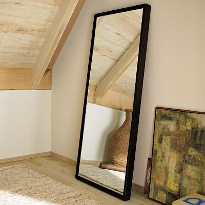
The first and easiest is to find the largest premade framed mirror you can, whether it's a wall mounted or leaning mirror.  This is easy, and relatively inexpensive... What would make this even more impressive though, is if you were to place 3 of them side by side to really fill the wall.  This would create a unified piece of architecture when ganged together and give you all the bang without all the bucks.  A wonderfully clean lined one, is shown here from West Elm.

West Elm's "Floating Wood Mirror" for only $399.00.

The next level in commitment to the large mirror idea would be to have a framed mirror constructed on-site.  I love this look because it's so unexpected and over sized, that you can't help but be impressed.  Vicente Wolf, one of my favorite designers uses these types of mirrors fairly frequently in his designs.

Vicente expands this bathroom with this gigantic white lacquered framed mirror.

If you're not afraid of commitment, then go for the gold and apply the mirror directly to the wall.  I think the best way to accomplish this without looking like a rack of free weights should be sitting next to a pile of used yoga mats in front of the wall would be to create a grid.  In the Holly Hunt showroom, she broke up the wall into segments using a simple oil rubbed bronze metal strip to create the framework.  This look is so simple, chic and successful.  You can also mix it up a little by using smoked or even Mercury antiqued mirror to give the grid even more depth and personality. 

Holly Hunt NY Showroom

Thursday, November 11, 2010

Highlights Past Projects: Great Room that really is GREAT!

Through soothing colors and fabrics a comfortable seating area was created with a large sectional sofa. Sage colored linen wraps the sofa, and is popped with white and mint linen pillows along with gorgeous damask pillows. Lush throws are placed within arm's reach of anywhere you decide to sink in.

A work area was created by building in a desk unit made out of stained Rosewood and a Black Absolute top. Fixed white lacquered shelves are hung to accommodate all the standard workings of an office.

Three gorgeous marble-topped bistro tables are put together, surrounded by a custom chocolate ultrasuede banquette, to give the wonderful atmosphere of your favorite restaurant's corner table. Sconces can be dimmed and the mirror wrapping just high enough around the walls transports you every night to a five-star experience...

A 100 year old Steinway & Sons Concert Grand sits proud and center... As it should. It's Rosewood veneer adds depth and movement to the rooms, very straight and recta-linear lines.

A television is recessed into a limestone surround, over a real wood burning fireplace. Custom leather caps were added to the sofa, not only to prevent the natural wear and tear of a family's sofa, but also to give a tailored look, much like a fine English suit. Amazing and curious accessories are placed strategically to create visual interest and give the room character.  

Friday, November 5, 2010

Hotels for creative inspiration...

Everyone gets stuck sometimes with the creative process, especially when you do this day in and day out...  One thing that I find to help just stir those design molecules up is looking to really wonderful hotels.  In this particular branch of design, things aren't always translatable into the residential market, but it provides an amazing place to start.

In the hotel industry it's about being new, innovative, and memorable... This is why I say things aren't always possible to literally translate.  Hotels love to push the limits of what a residential setting would be, but maybe tweak things enough to show you a combination of colors and patterns that you'd never in your life put together for yourself, but somehow it's all working to create an environment; whether it's soothing and spa like, or hip and trendy...

Here are three examples of places that I've stayed at that appeal in different ways, but are all excellent examples of how you can take pieces to incorporate into your own home.


Hotel le Germain is a casual and comfortable little boutique hotel Adrian and I stayed at when we got married in Toronto.  The decor was simple and chic.  Pops of color really only with artwork, but a very well thought out space.  One really fun detail in all the rooms is the feature of the bath/shower area being totally exposed to the sleeping quarters with only an operable wood blind and glass separating the spaces...  Such a great way to visually extend the space, since the rooms were spacious, but not huge, and also give your mate a little bit of a show!


Tucked away on Gold Street in Manhattan sits Gild Hall...  What a great and relatively inexpensive place to stay at.  The hotel is sort of a cross between industrial chic, a lodge, and a stable type setting...  The large leather tufted headboard dominates the room as it sits proud of a graphic gold wallpaper.  The accommodations were not large, but they made it feel homey and comfortable.  I love the touches of black throughout the space, in the night tables, and the crown, chair and base mouldings.  This proves that painting these trim pieces in dark colors is not a bad thing, as most people as a rule of thumb automatically go white with their mouldings...  Think again!


Finally right on Thomas Circle in D.C. is another hotel from the same company that gave us Gild Hall.  This is Donovan House.  It's got a wonderfully modern aesthetic with a delightful rooftop pool.  The furnishings were all modern and almost space aged.  Here the predominant color in the rooms was eggplant; so unexpected and refreshing.  It was set off nicely with the integration of white lacquer pieces and dark espresso finished woods.  Another prime example for people to think out of the box as to what colors can be used in what proportions.  The use of this deep purple was significant, but in no way was it too much.  It was in fact quite soothing; perfect after roaming around all the monuments and museums all day.

So go out there, and spend a night in a hotel as a little get away for yourself, and let your mind go free to take in the possibilities of what you can do in your own "hotel suite"...

Tuesday, November 2, 2010

Brown paper packages tied up with strings...

So just a random few of my favorite fun and practical accessories to help brighten up any room, that also make really great gifts for the upcoming holidays...

Everyone needs a radio/iPod dock nowadays, and there's no reason it shouldn't also be attractive to look at while sounding good.  I have two favorites, both of which I own and use.  They come in many different finishes and sizes, but I just find the sizing and aesthetics of both products to be so much better than a standard dock from your local electronics shop...  This is the Small sized stereo from Gevena, and the Model One from Tivoli Audio, both shown in Walnut.


So who doesn't need to tell time?  Well no one really, so this is one of the more whimsical items I love, and actually showed installed a few posts ago, but this is the wonderful Cuckoo Clock by Pascal Tarabay...  It comes in a wide variety of finishes, such as the Walnut and White shown below; all with a great setting on the clock to only sound when the room is lit so no one needs to be disturbed while sleeping...


Lastly, a neat little thing that is amusing and educational not only for children but adults as well is the EcoSphere.  It is basically a blown glass sphere filled with everything needed to sustain life, without having to feed or care for the little shrimp in the orb.  I found it fascinating the first time I saw this years ago, and still am intrigued at the fact that this little science project of sorts can be something that is beautiful and inspiring...


The science behind the EcoSphere